Note
Go to the end to download the full example code.
Scatter Plot
This example demonstrates scatter_plot(), which plots the
per-sample value of an interaction against the value of one feature. For
first-order interactions this matches SHAP’s shap.plots.scatter; for
higher-order interactions the x-axis is restricted to a single feature in
the interaction tuple.
from __future__ import annotations

import matplotlib.pyplot as plt
from sklearn.model_selection import train_test_split
from xgboost import XGBRegressor

import shapiq
Train a Model
x_data, y_data = shapiq.datasets.load_california_housing(to_numpy=False)
feature_names = list(x_data.columns)
x_data, y_data = x_data.values, y_data.values
x_train, x_test, y_train, y_test = train_test_split(
    x_data,
    y_data,
    test_size=0.2,
    random_state=42,
)
model = XGBRegressor(random_state=42, max_depth=4, n_estimators=50)
model.fit(x_train, y_train)
Compute Explanations for Multiple Instances
We explain 200 test instances so the scatter plots show a meaningful distribution while keeping the example fast.
Default Scatter Plot
Without an explicit interaction, the most important interaction is
selected automatically (by mean absolute aggregated value).
shapiq.scatter_plot(explanations, x_explain, feature_names=feature_names)
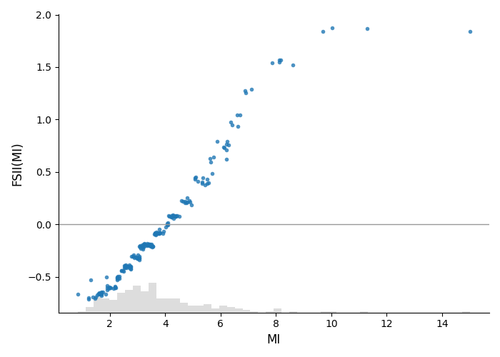
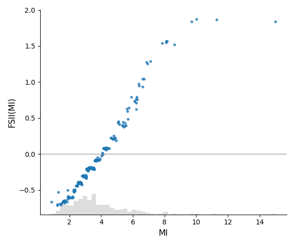
Main Effect of a Single Feature
Pass a feature name (or index) to plot its first-order Shapley value against its feature values.
shapiq.scatter_plot(
    explanations,
    x_explain,
    interaction="MedInc",
    feature_names=feature_names,
)
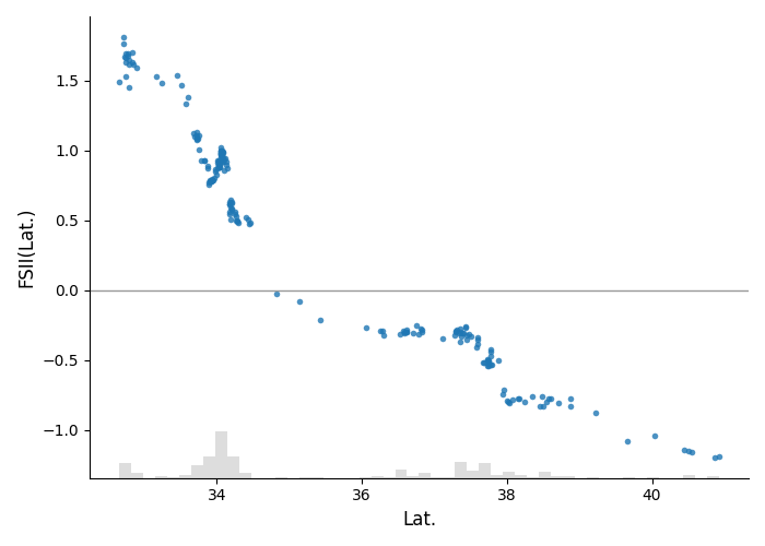
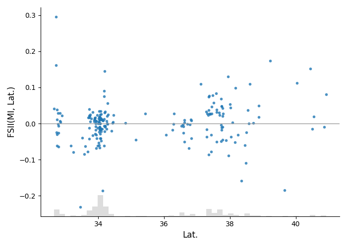
Pairwise Interaction
Plot a higher-order interaction value. By default the x-axis is the first feature in the interaction tuple.
shapiq.scatter_plot(
    explanations,
    x_explain,
    interaction=("MedInc", "Latitude"),
    feature_names=feature_names,
)
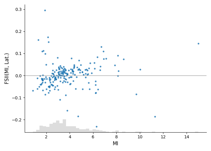
Pairwise Interaction with Chosen X-axis
Use x_feature to switch which feature in the interaction is on the x-axis.
shapiq.scatter_plot(
    explanations,
    x_explain,
    interaction=("MedInc", "Latitude"),
    x_feature="Latitude",
    feature_names=feature_names,
)
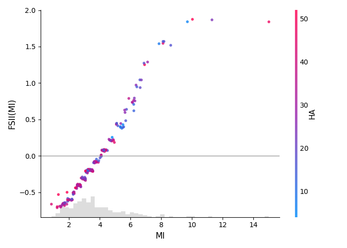
Color by Another Feature
Set color to render points using a red-blue colormap based on another
feature’s value, and add a colorbar.
shapiq.scatter_plot(
    explanations,
    x_explain,
    interaction="MedInc",
    color="HouseAge",
    feature_names=feature_names,
)
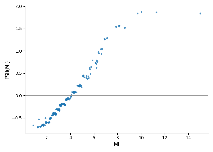
Disable the X-axis Histogram Strip
By default a faint histogram of the x-axis feature is drawn along the bottom
(SHAP-style). Pass hist=False to hide it.
shapiq.scatter_plot(
    explanations,
    x_explain,
    interaction="MedInc",
    feature_names=feature_names,
    hist=False,
)
Custom Axis
Total running time of the script: (0 minutes 11.843 seconds)